My dad got a TechDisc — a disc golf disc with an IMU in the middle of it. Throw it, and a few seconds later your phone has fifty-three fields describing what just happened: speed, spin, nose angle, hyzer angle, off-axis wobble, an estimated distance, the raw inertial trace, the disc you used, the time to the millisecond.
Fifty-three fields, and not one sentence about what to do differently.
That gap is the whole project. A number is not feedback. “Nose angle 2.4°” only becomes coaching once you know whether 2.4° is good, whether it is good for you, and whether it is the thing costing you the most distance right now. Answering those three questions turned into a couple of months of evenings, sixty-one commits, and a small pile of statistics I had to argue with before I trusted any of it.
Getting the data out
TechDisc has no documented public read API. The only thing they advertise as an API is a game-controller token for pushing throws into partner games — it does not let you read your own data back out.
Underneath, the app is Firebase. The Firestore project is throw-log, your throws live at users/{uid}/throw-summary, and each document id is the throw’s time in unix seconds. That would be easy, except App Check is enforced with reCAPTCHA: a headless script that logs in correctly with the right email and password still gets 403 PERMISSION_DENIED, because the token that satisfies App Check is only minted inside the genuine, logged-in web app.
So both exporters run inside a real browser context and reuse the token that is already there — one as a paste-into-DevTools console script with nothing to install, one as Playwright driving a real Chromium. Neither reads pixels off the screen. Both page through the structured Firestore documents and write JSON. Everything downstream is offline.
Compared to what?
Once the throws are local, the interesting question is the comparison. There are three honest answers, and the app uses all three.
Against yourself. Throws are grouped into practice sessions by a time gap — any break longer than sixty minutes starts a new session — and each session’s averages are compared to every throw you have ever recorded before it. The comparison is in standard deviations of your own baseline, not raw units, so a change only registers if it is large relative to your normal scatter. The threshold is 0.3 SD, and a finding needs at least ten throws behind it: the standard error of a session mean is σ/√n, so a 0.3 SD move of a four-throw average is noise, while the same move over thirty throws is signal.
Against absolute skill tiers. Plain Beginner-to-Pro bands for distance, speed and spin. Crude, but it works on day one, before you have any history at all.
Against the pro field. This is the one that took actual work.
TechDisc broadcasts live throw data during major events through a public “TD Live” account. I did a one-time read of that account and sliced it by event date window: 24,860 throws pulled, 18,527 of them inside a real event window, across ten catalogued events — nine with usable data. USDGC, PDGA Worlds, OTB Open, Champions Cup, and the distance competitions.
What gets stored is percentiles, never raw pro throws — p10, p25, p50, p75, p90, p95 per metric, per shot type, per field. The entire pro comparison ships inside the app as 8 KB of JSON. That mattered more than it sounds: the app had to work on my dad’s PC, and the pro comparison had to work there without an internet connection, an account, or a scraper he would have to keep alive.
Two benchmarks that are never merged
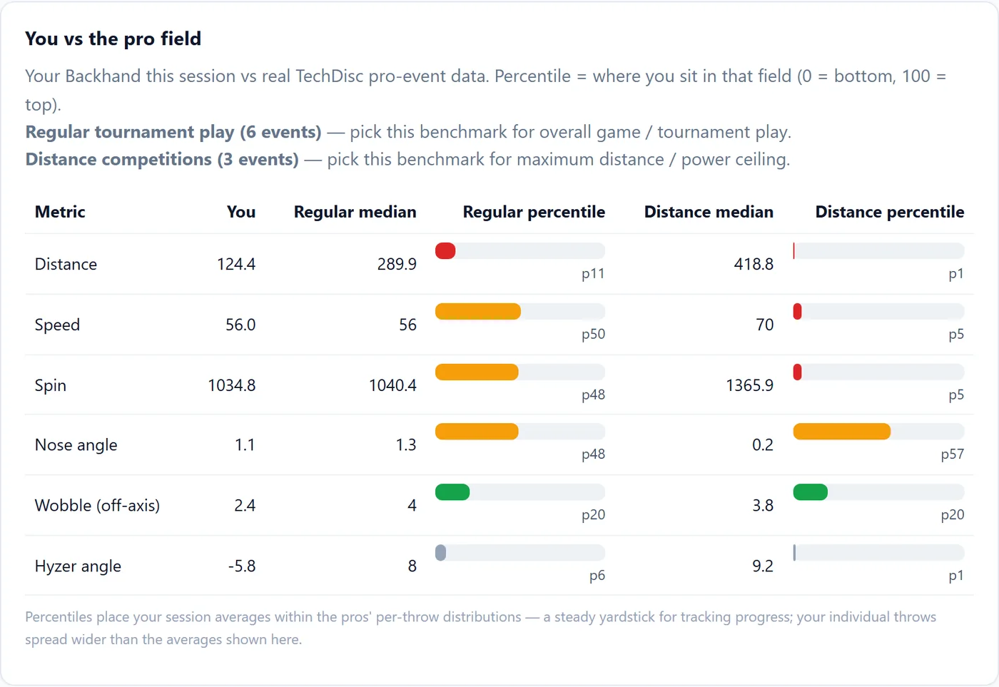
The pro data splits cleanly into two populations that measure different things: regular tournament rounds (six events, ~13.4k backhand throws) and max-effort distance competitions (three events, 399 throws). Tournament backhands have a median distance of 290 ft. Distance competition backhands median 419 ft, with p90 at 537 ft.
Blending those into one benchmark produces a number that means neither. So the report shows both, side by side, and never averages them:

Look at the distance row. Against tournament play this thrower is at p11; against distance specialists, p1. Those are two different, individually meaningful facts — a developing player near the bottom of normal tournament play is nowhere against people whose entire event is throwing as hard as they physically can. One merged percentile would have hidden that. The same session is at p50 for speed and p20 for wobble, which is the actual story: the power is unremarkable, the release is genuinely clean, the distance is not there yet.
Percentiles come from piecewise-linear interpolation between the stored percentile points, with mild anchors past p10 and p95 so values off the end of the table still map somewhere sensible instead of clamping. Spin is compared by magnitude, because forehand spin is stored negative. Bars are coloured by direction, not by value — a high percentile is green for speed and red for wobble.
What actually moves your distance
The headline model. “What should I work on to throw further?” gets answered three ways — which are deliberately not given equal weight.
- Pearson correlation of distance against each metric.
- Longest 20% versus the rest — the standardized gap in each metric between your bombs and everything else.
- Standardized multiple regression,
distance ~ z(speed, spin, nose, wobble, hyzer).
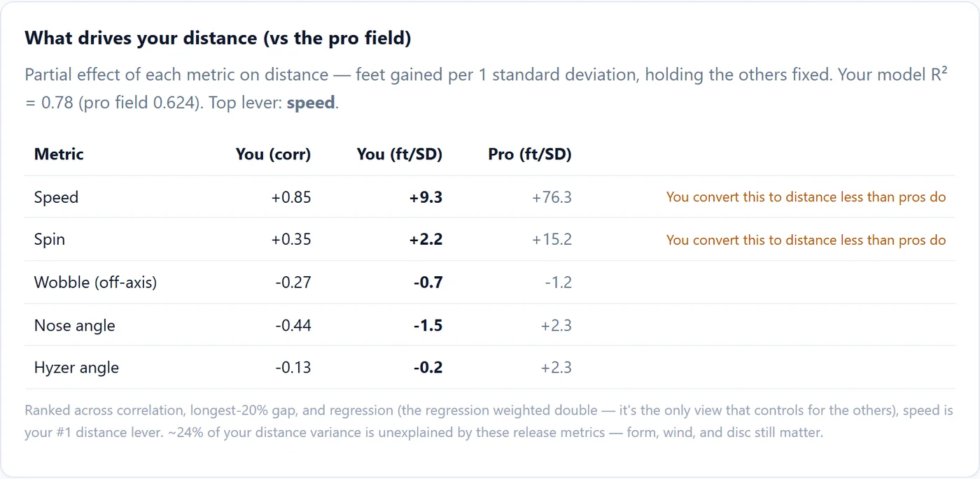
The third is the one that matters. Speed and spin move together on almost every throw, so correlation double-counts them; the regression reports the partial effect of each metric while holding the others fixed, in feet gained per one standard deviation.
The first two methods are not independent witnesses — they both measure marginal association, so they agree by construction. Treating them as three equal votes would let the two correlated views outvote the only partialled estimate. The combined ranking weights the regression double instead. Predictors with poor coverage get dropped automatically (launch angle is usually null in TechDisc’s data, and leaving it in would silently shrink the sample to the rows where it exists).
The unit trap
Now look at the speed row in that table: +9.3 ft per SD for this thrower, +76.3 ft per SD for the pro field. Eight times worse. The report even labels it — “you convert this to distance less than pros do.”
That conclusion is wrong, and it is wrong in an instructive way.
A coefficient in feet-per-standard-deviation is only comparable across two populations if the standard deviations are comparable. They are not. The pro field’s speed SD is 10.5 mph, because it pools everyone from a 43 mph control shot to an 85 mph distance attempt. This thrower’s speed SD, recoverable from the report’s own what-if row, is about 1.3 mph — one person, one shot, one afternoon.
Convert both to the same unit and the gap evaporates:
| β | speed SD | ft per mph | |
|---|---|---|---|
| This thrower | +9.3 ft/SD | ~1.3 mph | ~7.0 |
| Pro field | +76.3 ft/SD | 10.5 mph | ~7.3 |
He converts arm speed into distance at essentially the pro rate. What he does not have is the range — his speed barely varies, so a standard deviation of it is a small thing. The eightfold difference was a unit artifact, not a mechanical deficiency, and telling a developing player his speed doesn’t convert would have been actively bad coaching. That comparison is getting reworked into per-mph units before this feature keeps that label.
I am leaving this in the write-up rather than quietly fixing it because it is the most useful thing in the project: the model was right, the arithmetic was right, and the sentence on top of it was still false.
Does the release break down under power?
The other big claim the app can make is an interaction: does wobble cost more distance when you throw hard? That is tested three ways — a continuous speed × wobble term, the wobble-to-distance slope computed separately within low, mid and high speed terciles, and a 2,000-replicate bootstrap confidence interval on the high-power slope. The bootstrap resamples by session, not by throw, because throws in one session share a day, a wind, and a warm-up state, and a throw-level bootstrap would report a confidence interval far too narrow.
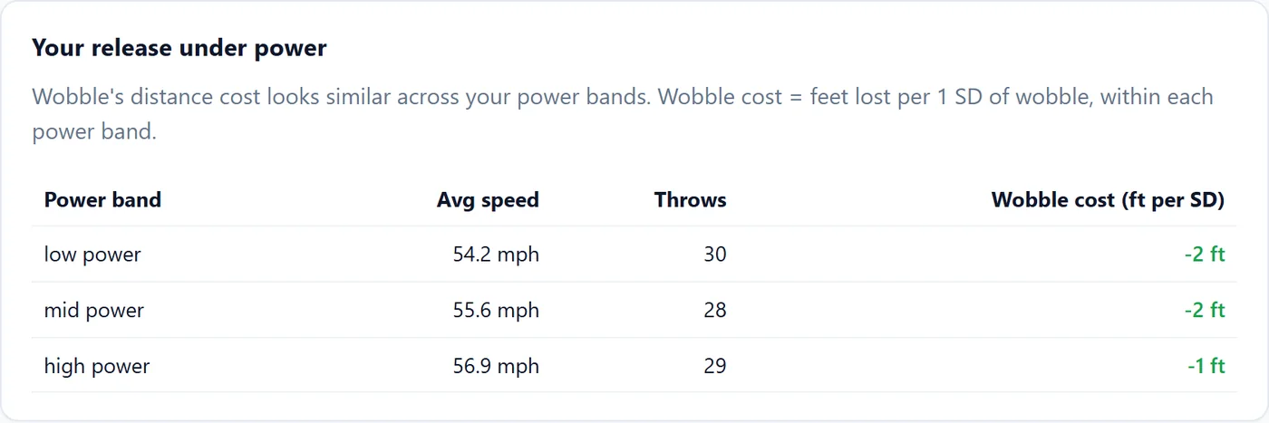
For this player, it came back flat: about −2 ft per SD of wobble at low power, −2 at mid, −1 at high. No breakdown under power. The report says so plainly — “wobble’s distance cost looks similar across your power bands” — rather than reaching for the more interesting story. A model that can only find effects is not a model.
Both of these claims were also re-derived and attacked by three separate analyses each, stress-testing multicollinearity, outliers and leverage, alternative binning, robust regression, and confounds. The saved verdicts record what survived and the caveats — the power-wobble gradient is robust in direction but its exact magnitude is estimator-dependent, so it gets reported as a range.
One number for form
Percentiles are demoralising when you are at p11. So there is a second score that has nothing to do with power:
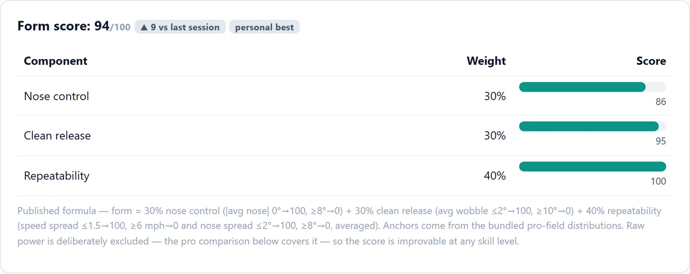
Thirty percent nose control, thirty percent clean release, forty percent repeatability. The anchors come from the bundled pro distributions and every one of them is printed on the card — nothing about the number is hidden. Raw distance is deliberately excluded, which is the entire design: form score is improvable at any skill level, so the 124-foot thrower at p11 against the pro field can still be at 94 and still see it climb. Both numbers are true. Only one of them is motivating on a Tuesday.
From statistics to a next session
The report opens by checking the goal the previous report set, and closes by setting the next one, so sessions chain into a loop rather than each producing an isolated verdict. Between those, the findings are quantified and specific:
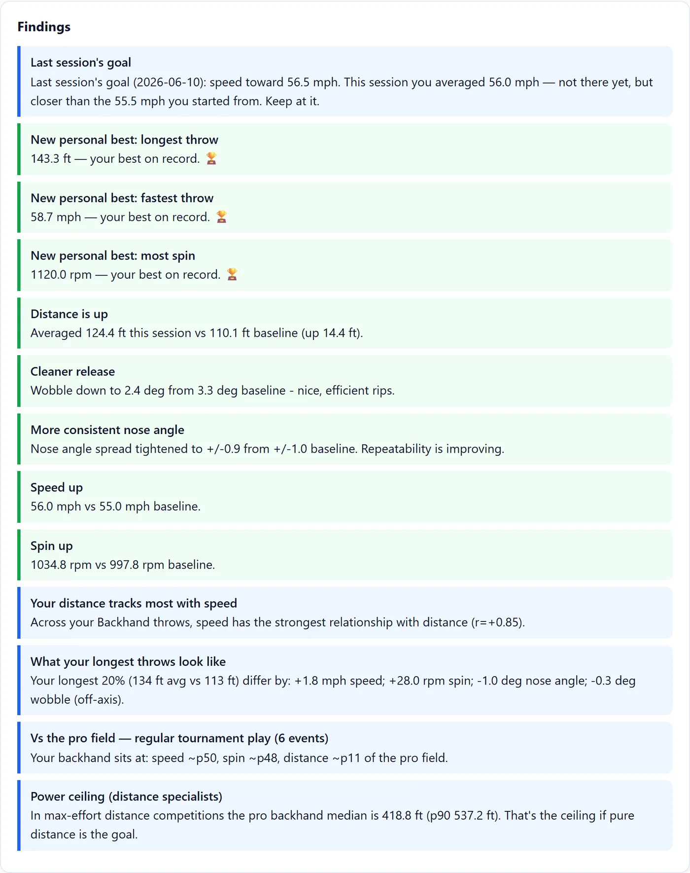
Everything on that list is either a number from the player’s own history or a number from the bundled pro tables. There is a scripted 15-throw assessment too — the Combine, five flat, five hyzer, five anhyzer at full effort — because free practice mixes shot types and session totals are not strictly comparable across days.
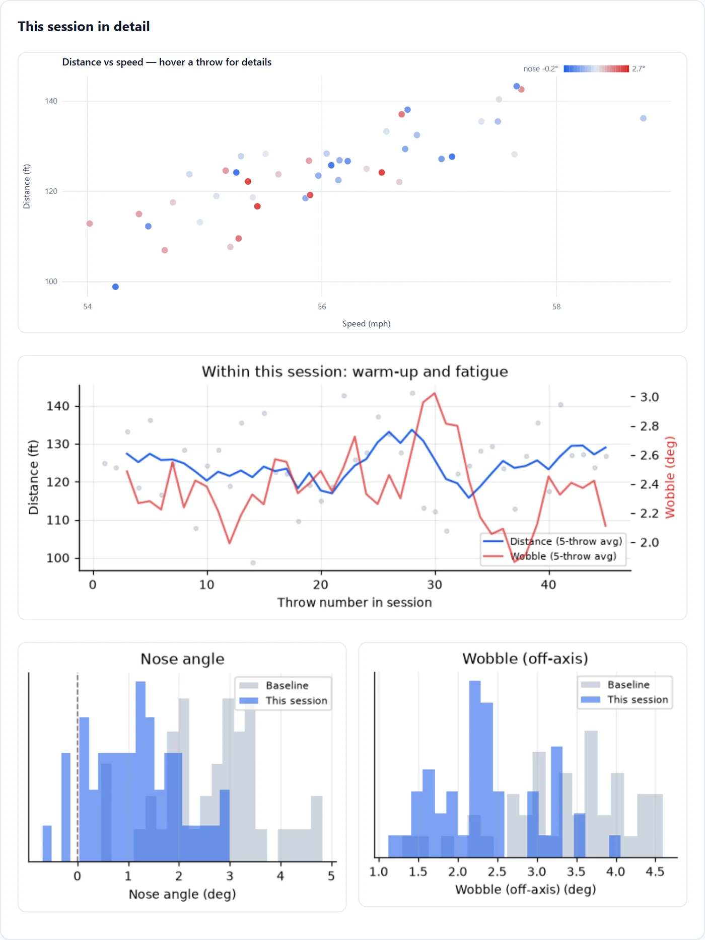
And underneath it all, the session as it actually happened:
Shipping to someone without a terminal
None of this is worth anything if the person it was built for cannot run it. My dad is not going to pip install anything.
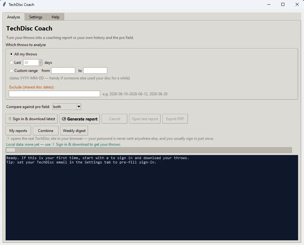
Double-click run.bat. It builds its own environment, fetches the sign-in browser, and opens the app. Sign in once with button ①, generate a report with button ②. The date-range selector exists for an entirely unglamorous reason: someone else threw with his disc while he was signed in, and those throws had to come out of the analysis without deleting them.
The written coaching is rule-based by default — deterministic, offline, no key, always works. There is an optional upgrade to the Nous Research inference API (hermes-4-405b by default) which receives the computed statistics only, never raw data, with instructions to use those numbers and invent nothing. If the key is missing or the call fails it falls back to the rules and prints the error. Identical stats reuse a cached answer, and there is an optional monthly token cap. The default path costs nothing and works on a plane.
What review did to it
The thing that changed this project most was not a feature. It was reviewing it from four lenses at once — engineer, competitive landscape, product manager, and end user — and writing the findings down before fixing any of them. The engineer’s list found spin-sign and exclusion bugs. The user’s list found that the first-run experience was hostile. The PM’s list killed features I wanted to build.
Every finding that survived became a commit, and the ones that were bugs became tests: 215 tests across 24 files, with past review findings encoded as regressions so they cannot come back. The statistical soundness fixes have their own file.
What it is not
This is observational, single-player data. TechDisc’s distance is a model estimate, not a tape measure. Every finding here is an association inside one person’s throws, and the pro comparison is a snapshot of nine broadcast events, not the sport.
What it is: a disc that records fifty-three numbers, and a report that turns them into one thing to work on this week.
The repository is private — it carries one person’s throw history — so this write-up is the public version of it. If any of the above is useful to you, the methods are all here: the percentile interpolation, the standardized regression, the session-clustered bootstrap, and the habit of converting to a common unit before believing a comparison.